Friday, October 24, 2014

Painting in Photoshop

At the beginning of this project, we learned how to mix brushes and use different types of brushes. We expressed this in this image:

Then we were to apply what we learned to a landscape image and I ended up creating this:


Then, I expanded my knowledge and applied what I had learned to a project of my own. I found an image on 500px.com and opened it in photoshop. I used various brushes, brush presents, and colors and formed this wondrous image.


Monday, October 13, 2014

Quarter One Project

For my quarter one project, I was lucky enough to be chosen to work on a super important brochure for Dr. Poss. I was presented with a 6 page packet of the information regarding this brochure. It was for a health care grant Dr. Poss was trying to get for our school.

THE LOGO PROCESS:

My project began abruptly, and we worked quickly. Over the course of two weeks, Miss Meyer and I worked tirelessly on sketches, logos, concepts, and covers. My first steps were working in my sketchbook. I created a word list of various concepts to research online. I also came up with different slogans to possibly use on the brochures. Then I was told to create as many different sketches as I could. I ended up with 26. Once my sketches were finished, I showed Miss Meyer and she told me which ones to take into Illustrator. The logo process took a lot longer than I would've thought. We ended up with three final logos we liked, so we took them to one of our clients to get more direction. Once we had more information, we could push these logos into our brochure covers.

THE COVER PROCESS:

I dove right in. I started with brainstorming certain concepts to get the "You Matter" theme continued.  After many many many different covers and many many many alterations and versions, we ended up with two different concepts for our two different logos that we liked. However, we were not even close to done. Once we finished the front cover, we had one day left to finish the back of the brochure that explained all of the information the clients needed to share. We worked really hard on the backs and making sure they matched the front. Once we finished the cover and the backs, we still had one more step. We printed and mounted each logo and each concept onto black board to make it look all pretty and nice. Finally, we were finished and we could bring our final products to our clients.

Thursday, September 11, 2014

Cube Project

I really enjoyed the cube project. I started like the rest of the class, following the tutorial, and I created this:
Then, we were instructed to create a cube logo of our own. I took the techniques I learned from the video and applied them to my own ideas. At first, I thought simplicity would be a more appealing logo. So, I used three of the cubes and used different shades of a pretty blue color. I added a stroke to each panel of the cube, because I liked the mystery of the space added between. Then, I pieced the cubes together in a way to shape yes, three cubes placed together, but also if you looked at it a different way, it looked like a shiny shield. I loved the double meaning of the logo, so I went with it:
Finally, I went even further and added more to the logo. I knew I wanted to incorporate at least one more shape. I started by deleted the fill to the cube and just having a stroke, creating a sort of Y shape. I played around with it a lot, and at first it looked like these three Y's holding the cube in place. I decided I wanted these Y's to connect, so I connected them, creating the square behind the blue cube. Then, I took more and more of those Y's and connected them creating the hexagons. Then, I knew I needed something to encompass the art. I created the triangle and added a fill to it to add a pop to the logo. I added the word "Design" and BAM I had a logo.

My Font

Today we took a quiz to determine the font that we portray. My font was cooper plate, because my attributes were: emotional, assertive, progressive, and relaxed. The font has all round curves and no edges, because it has no limits, no rules. I really do think this font describes my personality. I kind of have the attitude of "going with the flow" and I think that this font portrays that characteristic as well.

What is Graphic Design?

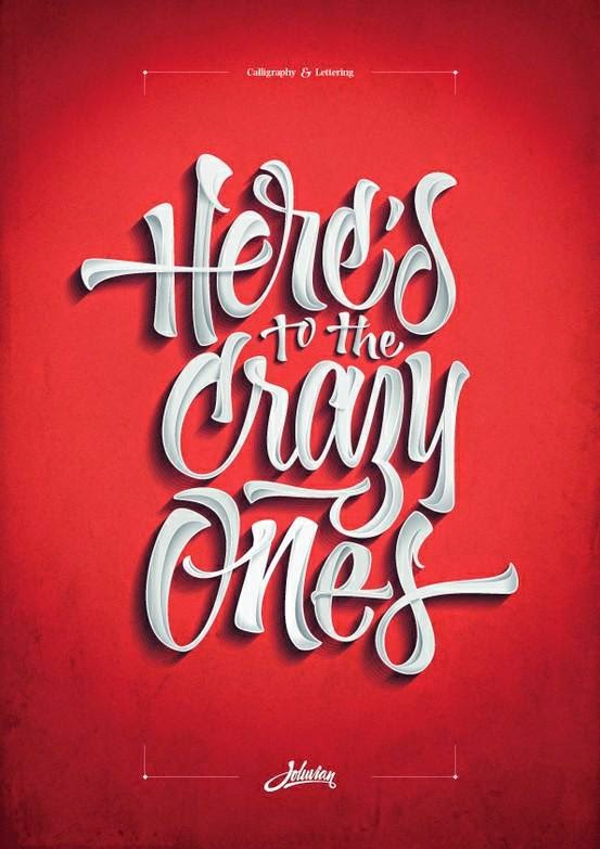
The official definition of graphic design is the art of skill of combining text and pictures in advertisements, magazine, or books. So, in other words, graphic design is the act of making information pretty. Usually graphic design can be found on posters, in commercials, or websites. It is all around us! It is used and seen every day. But to me, graphic design is a lot more. It's something that I'm really passionate about. When I first came into high school I knew I wanted to join eComm because I always thought I was going to study journalism of some sort. When I spent my first year trying out all the different "focuses" (video, web, graphic design, and animation), I fell in love with graphic design. Ever since I have wanted to major in graphic design in college and possibly work as a graphic designer when I'm older. I love designing with typography and creating logos. Here is an example of graphic design:

Tuesday, May 20, 2014

What e-Comm Is To Me

Olathe Northwest High School's e-Communication is incredible. Within this program students get to expand their creative desires and explore their skills through art. It is a place where everybody belongs and expressing yourself comes easily. In your first year of e-Comm you are transported through the different strands. Video, Animation, Graphic Design, and Web Design; one strand for each quarter. When you finish your first year you must decide which two strands you like best for your second year. Then for your third year, you must choose one strand. It is an impressive system, and it allows you to get a real feel for the strand you like best.

Here is a brief explanation for each strand:

Video: Within video there are sub-strands. You could choose broadcast journalism, sports journalism, or entertainment. In video, you create all sorts of projects while learning how to iMovie and FinalCutPro. You add text, effects, etc. It is a great strand and most who graduate the strand move on to studying film in college.

Animation: Animation is seems pretty simple: you create cartoons. Wrong. There is so much more to animation than anyone thinks! You must create pictures and sketches and sketch boards to create animation projects in Maya, Photoshop, After Effects, and Google Sketch Up. These students create things such as 3D houses, cartoon stories, 3D Characters, explosions, etc. It's an impressive strand and these students seem to grasp the concept of technology best in this strand.

Graphic Design: Graphic Design is a strand where you further your interests in logos, print layout, and illustration. You learn different aspects of Illustrator, Photoshop, and InDesign. It's a great strand and it really lets you explore yourself through art.

Web Design: Web Design is (in my opinion) one of the hardest strands of e-Comm. In this strand you learn how to code and create websites. It is very interesting to learn how to code because it's almost like a different language. In this class you will create all sorts of different websites in Dreamweaver while also using combined skills of photography and graphic design. Web is essential to all things e-Comm.

If I could recommend one activity to a student entering Olathe Northwest I would tell them to enter this program. It is an awesome way to create art.

Thursday, May 8, 2014

Logo Process

How does logo design tell your story?

A personal logo is the best way to represent yourself in an artistic way. When I first started making my logos, I found this color that I loved. I knew that I wanted to use that color no matter what. It is a mix between a blue and green and it is gorgeous. Blue is my favorite color, and the color of my eyes. Another reason I went with this blue/green is because it represents the clear blue sea. I love the ocean, and I love the waves, so this color (the very first step of my process) already represented me in many different ways.

My next step was choosing a shape to base my logo off of. I started with a square; a perfectionist shape (like me), then I tried a circle; a shape that represents unity. I liked them both, but they were too simple, the opposite of me. I tried everything from peace signs to ying-yangs, but nothing was quite right. A combination I really liked were three circles in a row which reminded me of a "..." I messed around with a couple things coming up with two different logos using the "..." shape theme. When I asked for some input from my friends, they suggested that I combined the two versions. When I did, it was clear that was the logo to go with.

When it came to choosing fonts, it was easy. There are certain fonts that I believe completely resemble me in many different aspects. I chose the font Book Antiqua as well as Jellyka Princess. Overall, I'm very happy and very proud of my final product.