Thursday, October 30, 2014

Sub for Field Trip Blog

Since I missed the field trip, I will write about my process with my brochure project.

My process began with brainstorming concepts in my notebook, then I moved into sketching logos. After my logos were sketched, I showed my project manager and she told me which logos to push in illustrator. Once I created those logos in illustrator, we checked with the client to see which logos she liked the most. With those two logos, I created two different concepts for the brochure cover. Then we printed and mounted the concepts and gave them to my client to present. When my client won the grant, I pushed the one concept she liked the most. I am still working on it and it is an ongoing project, but for right now I am in a good spot.

Below I have attached the first 13 logos I sketched as one of the first steps to the process.

Friday, October 24, 2014

Painting in Photoshop

At the beginning of this project, we learned how to mix brushes and use different types of brushes. We expressed this in this image:

Then we were to apply what we learned to a landscape image and I ended up creating this:


Then, I expanded my knowledge and applied what I had learned to a project of my own. I found an image on 500px.com and opened it in photoshop. I used various brushes, brush presents, and colors and formed this wondrous image.


Monday, October 13, 2014

Quarter One Project

For my quarter one project, I was lucky enough to be chosen to work on a super important brochure for Dr. Poss. I was presented with a 6 page packet of the information regarding this brochure. It was for a health care grant Dr. Poss was trying to get for our school.

THE LOGO PROCESS:

My project began abruptly, and we worked quickly. Over the course of two weeks, Miss Meyer and I worked tirelessly on sketches, logos, concepts, and covers. My first steps were working in my sketchbook. I created a word list of various concepts to research online. I also came up with different slogans to possibly use on the brochures. Then I was told to create as many different sketches as I could. I ended up with 26. Once my sketches were finished, I showed Miss Meyer and she told me which ones to take into Illustrator. The logo process took a lot longer than I would've thought. We ended up with three final logos we liked, so we took them to one of our clients to get more direction. Once we had more information, we could push these logos into our brochure covers.

THE COVER PROCESS:

I dove right in. I started with brainstorming certain concepts to get the "You Matter" theme continued.  After many many many different covers and many many many alterations and versions, we ended up with two different concepts for our two different logos that we liked. However, we were not even close to done. Once we finished the front cover, we had one day left to finish the back of the brochure that explained all of the information the clients needed to share. We worked really hard on the backs and making sure they matched the front. Once we finished the cover and the backs, we still had one more step. We printed and mounted each logo and each concept onto black board to make it look all pretty and nice. Finally, we were finished and we could bring our final products to our clients.

Thursday, September 11, 2014

Cube Project

I really enjoyed the cube project. I started like the rest of the class, following the tutorial, and I created this:
Then, we were instructed to create a cube logo of our own. I took the techniques I learned from the video and applied them to my own ideas. At first, I thought simplicity would be a more appealing logo. So, I used three of the cubes and used different shades of a pretty blue color. I added a stroke to each panel of the cube, because I liked the mystery of the space added between. Then, I pieced the cubes together in a way to shape yes, three cubes placed together, but also if you looked at it a different way, it looked like a shiny shield. I loved the double meaning of the logo, so I went with it:
Finally, I went even further and added more to the logo. I knew I wanted to incorporate at least one more shape. I started by deleted the fill to the cube and just having a stroke, creating a sort of Y shape. I played around with it a lot, and at first it looked like these three Y's holding the cube in place. I decided I wanted these Y's to connect, so I connected them, creating the square behind the blue cube. Then, I took more and more of those Y's and connected them creating the hexagons. Then, I knew I needed something to encompass the art. I created the triangle and added a fill to it to add a pop to the logo. I added the word "Design" and BAM I had a logo.

My Font

Today we took a quiz to determine the font that we portray. My font was cooper plate, because my attributes were: emotional, assertive, progressive, and relaxed. The font has all round curves and no edges, because it has no limits, no rules. I really do think this font describes my personality. I kind of have the attitude of "going with the flow" and I think that this font portrays that characteristic as well.

What is Graphic Design?

The official definition of graphic design is the art of skill of combining text and pictures in advertisements, magazine, or books. So, in other words, graphic design is the act of making information pretty. Usually graphic design can be found on posters, in commercials, or websites. It is all around us! It is used and seen every day. But to me, graphic design is a lot more. It's something that I'm really passionate about. When I first came into high school I knew I wanted to join eComm because I always thought I was going to study journalism of some sort. When I spent my first year trying out all the different "focuses" (video, web, graphic design, and animation), I fell in love with graphic design. Ever since I have wanted to major in graphic design in college and possibly work as a graphic designer when I'm older. I love designing with typography and creating logos. Here is an example of graphic design:

Tuesday, May 20, 2014

What e-Comm Is To Me

Olathe Northwest High School's e-Communication is incredible. Within this program students get to expand their creative desires and explore their skills through art. It is a place where everybody belongs and expressing yourself comes easily. In your first year of e-Comm you are transported through the different strands. Video, Animation, Graphic Design, and Web Design; one strand for each quarter. When you finish your first year you must decide which two strands you like best for your second year. Then for your third year, you must choose one strand. It is an impressive system, and it allows you to get a real feel for the strand you like best.

Here is a brief explanation for each strand:

Video: Within video there are sub-strands. You could choose broadcast journalism, sports journalism, or entertainment. In video, you create all sorts of projects while learning how to iMovie and FinalCutPro. You add text, effects, etc. It is a great strand and most who graduate the strand move on to studying film in college.

Animation: Animation is seems pretty simple: you create cartoons. Wrong. There is so much more to animation than anyone thinks! You must create pictures and sketches and sketch boards to create animation projects in Maya, Photoshop, After Effects, and Google Sketch Up. These students create things such as 3D houses, cartoon stories, 3D Characters, explosions, etc. It's an impressive strand and these students seem to grasp the concept of technology best in this strand.

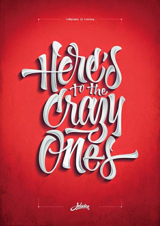
Graphic Design: Graphic Design is a strand where you further your interests in logos, print layout, and illustration. You learn different aspects of Illustrator, Photoshop, and InDesign. It's a great strand and it really lets you explore yourself through art.

Web Design: Web Design is (in my opinion) one of the hardest strands of e-Comm. In this strand you learn how to code and create websites. It is very interesting to learn how to code because it's almost like a different language. In this class you will create all sorts of different websites in Dreamweaver while also using combined skills of photography and graphic design. Web is essential to all things e-Comm.

If I could recommend one activity to a student entering Olathe Northwest I would tell them to enter this program. It is an awesome way to create art.

Thursday, May 8, 2014

Logo Process

How does logo design tell your story?

A personal logo is the best way to represent yourself in an artistic way. When I first started making my logos, I found this color that I loved. I knew that I wanted to use that color no matter what. It is a mix between a blue and green and it is gorgeous. Blue is my favorite color, and the color of my eyes. Another reason I went with this blue/green is because it represents the clear blue sea. I love the ocean, and I love the waves, so this color (the very first step of my process) already represented me in many different ways.

My next step was choosing a shape to base my logo off of. I started with a square; a perfectionist shape (like me), then I tried a circle; a shape that represents unity. I liked them both, but they were too simple, the opposite of me. I tried everything from peace signs to ying-yangs, but nothing was quite right. A combination I really liked were three circles in a row which reminded me of a "..." I messed around with a couple things coming up with two different logos using the "..." shape theme. When I asked for some input from my friends, they suggested that I combined the two versions. When I did, it was clear that was the logo to go with.

When it came to choosing fonts, it was easy. There are certain fonts that I believe completely resemble me in many different aspects. I chose the font Book Antiqua as well as Jellyka Princess. Overall, I'm very happy and very proud of my final product.


Tuesday, April 22, 2014

Kerning

Kerning is the process of adjusting the space between letters within a word. For example, a tight kern would be the what the font looks like right now. However, a wide kern would be if I were to  c h a n g e   t h e   s p a c i n g.

I owned up on the kerning game. My high score was 100/100!! Here's proof:

Tuesday, April 8, 2014

eMagine 2014

This past weekend was the Oscars of Kansas Art, eMagine.

I love this event because all of the people who attend are artists, just like me. I love seeing all of the projects from people I know from the school and strangers from other schools around the state. I think it's so cool how we host this event and I look forward to it every year! Maybe next year I'll win something. :)

I knew I wanted to be a graphic designer on my first day in Mr. Olson's room last year. I love creating projects never seen before. I love surprising people and making things so appealing to the eye that they can't turn away. It's something that I can actually see myself doing for the rest of my life.

GO ART


Friday, April 4, 2014

Googling Google

We see it everyday, we use it everyday...it's become a key component of the modern life. We know what it does, but the questions behind it are never-ending. How does it know so much? Where did it come from?


Google.


Quick Facts :

Google was founded in 1998 in Menlo Park, CA. Its headquarters are now located in Mountain View, CA (just 15 minutes apart).

The founders were both Stanford graduates.

Its first unofficial slogan was "Don't be evil."

Logo Evolution

 This was Google's very first logo. It was made on a free website in 1998.
 One of Google's more recent logos, but it interests me that it is very similar to the current logo, but not as appealing. The only difference is the gradients and drop shadows.
This is the most current logo made in 2013. I love it. It is clean and appealing!


I love how they have kept the same idea consistent throughout all these years! I'm interested to see what they will do in the future.


-T

Saul Bass Poster

The Seven Year Itch-Tess Reid

I made my poster representing the movie The Seven Year Itch starring Marilyn Monroe. On my poster I took inspiration from Saul Bass. I studied his posters, and downloaded his infamous font. I took the most memorable moment from the movie and recreated it. Once I noticed that wasn't enough, I read more about the movie. I learned that it's about a woman catching the eye of a married man who lives below her in their apartment. I decided to incorporate that by adding the building in the back.
Vertigo-Saul Bass

I chose this poster by Saul Bass because I felt it was nearest to my poster above. The buildings at the top of the poster look similar to the style I was going for when I created the apartment building. The font used in this poster is similar to most posters Saul Bass makes, Hitchcock, but it looks like he used a slightly different font this time. Another similarity in the posters is the border. I noticed Saul Bass usually leaves a unique border of white around his posters, so I recreated that. Overall I loved this project. Saul Bass is a cool guy.

Monday, March 31, 2014

Responsive Web Design and MMGY

PART ONE: Responsive Web Design is making a website that is easily understood and easy to use. It has become very important because it can be used on any device such as a mobile device or tablet. Media queries are CSS3 modules that adapt to conditions such as screen resolution. Breakpoints are temporary markers put in source code to tell a debugger to stop your application at a given line or variable.

PART TWO: http://www.mmgyglobal.com

In the wide version of this website, the viewer is allowed to see the full image and full website.


In this medium version the only thing that has changed is the cropping of the image. You still see the main focus of the picture, but it has been cropped to fit the screen.
In the narrow version of the site, the text has been modified and shortened. The image has now shrunk and you see the full image, just a smaller version. The first slide has now been pushed up the the very top showing the next slide below it (the red-orange), and the control panel now only consists of one option.

Monday, March 10, 2014

Values

How do the things I value reveal my personal story?

I believe that the ten top things I value really show my personality. If someone were to see my top ten, they could infer what kind of person I am. For example, I value optimism, the sun, and daisies. I think you could probably guess I have a bit of a bubbly personality. :)

As for my personal story, these ten things reveal my life. I love art, I love volleyball, and I love being happy. Basically, those top three things fill my days. I strive to be different and unique, I drive a VW bus. I love L.A., I'm a free spirit, and I need music. My brain obsessed over fashion, and I'm a bit of a hippie. Through these top ten things, you can see all of that.


Tess Reid


Monday, February 10, 2014

Vector Web Designs

DrupalCon Portland
http://www.atdrupalcon.com


This Web design definitely caught my eye. When I clicked on its link, I was further impressed. The layout is clean, appealing, and gives information. Not only did it master those three aspects, but it also is fun and entertaining. Once you enter the website you control a man and a bear fighting over a river. It's a bit random, but I think it's humorous and entertaining.


Windows Of New York
http://www.windowsofnewyork.com


I love this Web design. It is very cute, clean, and clever. In this website, the author just adds illustrations (made on illustrator) of different windows in New York. Under the illustration is the street it is on and the area it is in. The author uses different colors behind each window to make it look very appealing. This website is awesome!!!!!!


-T

Monday, February 3, 2014

Where Web Meets Illustrator

Amidst the article and video watched about setting up a web page through Illustrator, I have learned a few things.

First, always start in RGB Mode.
Always use layers.
Format text with the paragraph and text style panels.
Use paragraph or character styles panels to quickly format text.
Create effects, save them as graphic styles, and you can apply them to text, buttons, and shapes.
Use the symbols panel.
Make design clean and simple.
Apply an opacity masks with a gradient to make a progressive version of the picture that looks sweet.
Stroke gradients.
Grids.
Last but not least, always be pixel-precise.

Woohoo

-T

Friday, January 31, 2014

Conflict

Yesterday my class went on a field trip. I didn't. I wish things were as easy as my early years at school, but turns out High School is Anti-Utopian. Since collapsing into the world of responsibility, fun has been pushed further and further down the priority list.

My class visited Nerman Art Museum at the local community college, JCCC. I love art. I love art museums. I don't really understand most of the work, but I love trying to unlock the secrets beneath the surface. Since I missed the field trip because of my school responsibilities, I have been forced to read pamphlets and articles about the museum.


Here is my favorite piece from my forced learning session through the internet. Although I didn't see it in person, this is my favorite:


This dude rocks. His exhibit is called 'Illuminate.' He had all these different pieces similar to the picture above. Each piece had a series of beautiful lights illuminating the room.


I wish things were as easy as my early years at school, I feel like I really missed out.


-T